Welcome to the self-publising workshop!
- #000000
BLACK (A3) - #3255A4
MEDIUM BLUE (A3) - #00A95C
GREEN (A3 + B4) - #FFB511
SUNFLOWER YELLOW (A3) - #FF665E
RED (A3 + B4) - #0078BF
BLUE (N.B. B4 only!) - #FF48B0
FLOURESCENT PINK (A3) - #FFE800
YELLOW (A3) - #62C2B1
SEA FOAM (A3) - #BB8B41
FLAT GOLD (A3)
An overview of our available ink colors and which machines they are available. Read more about how riso ink and color mixing works further below.
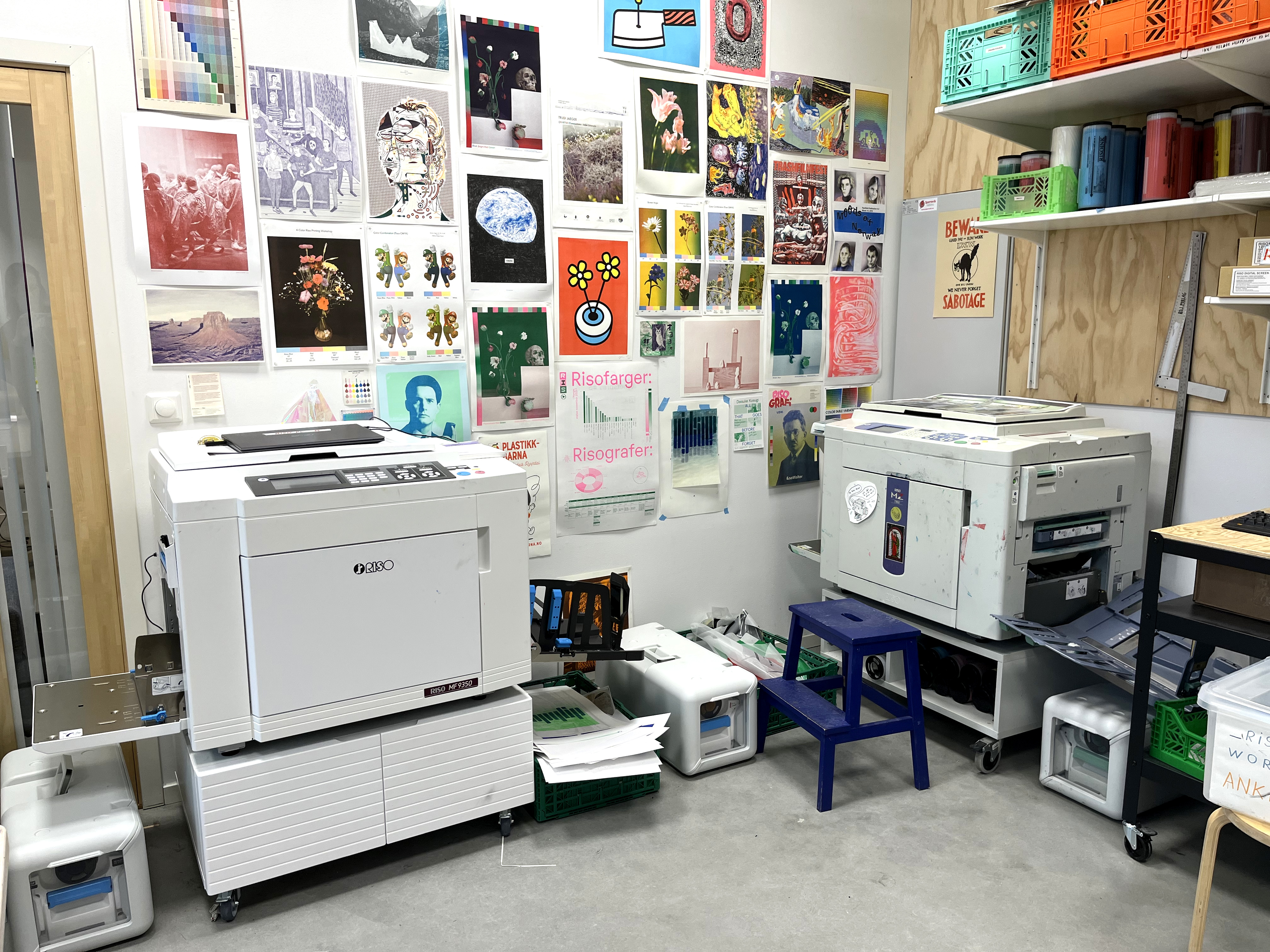
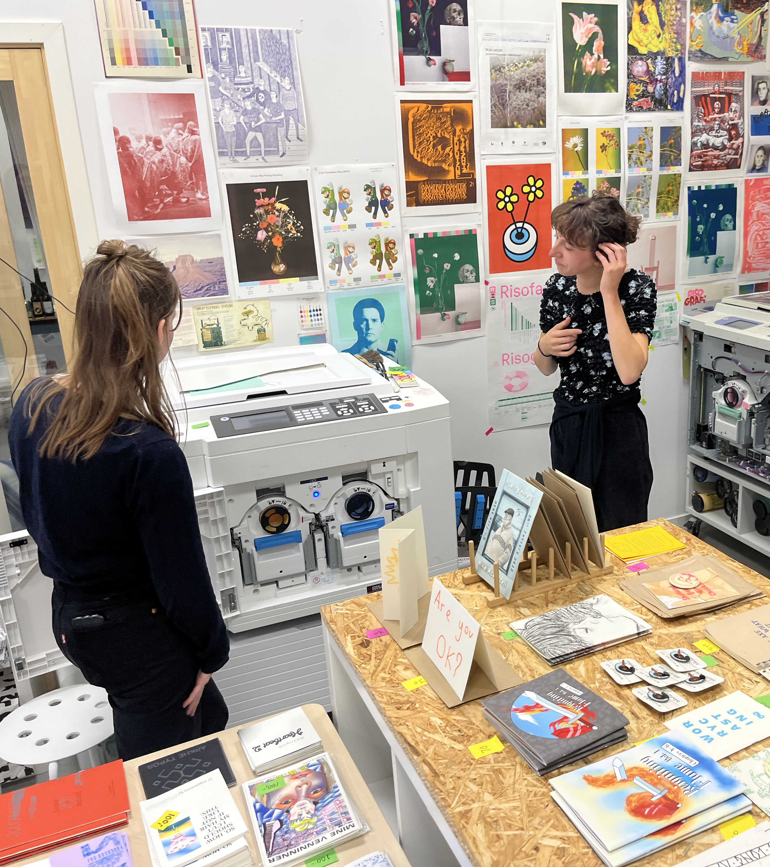
Pamflett is a publishing workshop that works with risograph printing. We are available for artists who want to make their own publications, and we also print smaller projects on demand, such as flyers, pamphlets, zines and posters.
If you are interested in printing with us, attending a workshop, getting a project printed for you, or if you have any questions at all, get in touch! We can be reached at hei@pamflett.no.
Check the calendar for upcoming workshops if you want to learn risograph printing.
Keep scrolling to learn more about estimated time frames for printing, workshops, available colors, paper, file preparation, riso quirks and disclaimers!
Important info
We are not a full-time printer, as Pamflett do other projects such as residencies and art book fair, and sometimes we travel. Please book your project well in advance :-) You can of course ask for last minute print jobs, and see if we have time. We print only on the risograph.
Estimated time frame for productions
(depending on the complexity of the project and how busy the workshop is)
- Small jobs (posters, flyers): Ready print files need to be sent to us 1 week or more before you need the finished prints.
- Larger jobs (booklets): Depends on the scale, contact us as early as you know the scope of your project. Ready print files need to be sent to us 2-3 weeks before you need the finished prints.
If you would like us to do any file preparation (like color separation), or do any finishing work after printing (cutting the prints to their finished size, binding zines and pamphlets, etc.), please let us know as soon as possible, so that we can estimate the time and cost, and find a good solution together.
Please scroll down to the File Preparation-section further down this page, to see how the files should be set up.
Note on workshops
If there is no upcoming workshops, but you are a group of 4–6 people that want to learn to print with riso, please send us a request and we can make a workshop based on what you want to know or try out with the risograph at hei@pamflett.no
Paper
FORMATS
The risograph can only print on uncoated paper, between 80–250gsm.
We have a selection of different papers available, but you are also welcome to use your own, as long as it’s uncoated and within the range of suitable paper weights.
Maximum print size is a little less than A3 (291×413mm), and maximum paper size to print on is SRA3/A3+ (320x450mm).
WHY ONLY UNCOATED?
The riso ink need to absorb into the paper to stick. Coated paper means that there is a layer of plastic that keeps the ink from absorbing. Using recycled paper can also be difficult, as it often contains fragments of plastic inside the paper. Tracing paper (kalkert papir) can also not be used.
We stock paper from Munken (Pure and Lynx), and we can order other papers for your projects if you wish (please let us know well in advance if this is the case).
File preparations
When sending us files for printing, please keep these things in mind:
All files are:
- PDF
- Maximum A3 size
- in greyscale
- Include a 5 mm (minimum) white margin around the print
- Flattened: Avoid using transparency-effects without flattening/merging them into the layer
- Do not include crop marks, we will add them for you if needed
InDesign-files for further file preparations:
- Use separate layers for each color, clearly named with the ink color
- Send as a packaged InDesign-folder (we recommend using WeTransfer, Google Drive or Dropbox)
- Make the document size the same size as the prints will be
PDF-files ready for print:
- Separate PDFs for each color, clearly named with page numbers and ink color
For the best possible results, we appreciate it if you can send us a preview of how the finished prints should look, in color (a dummy). Feel free to send us an email if you have any questions or need any help with the file preparations!
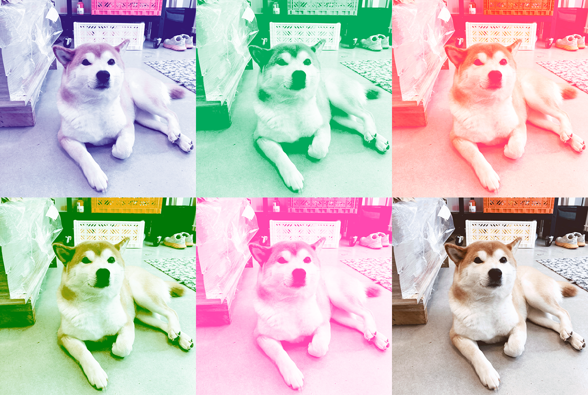
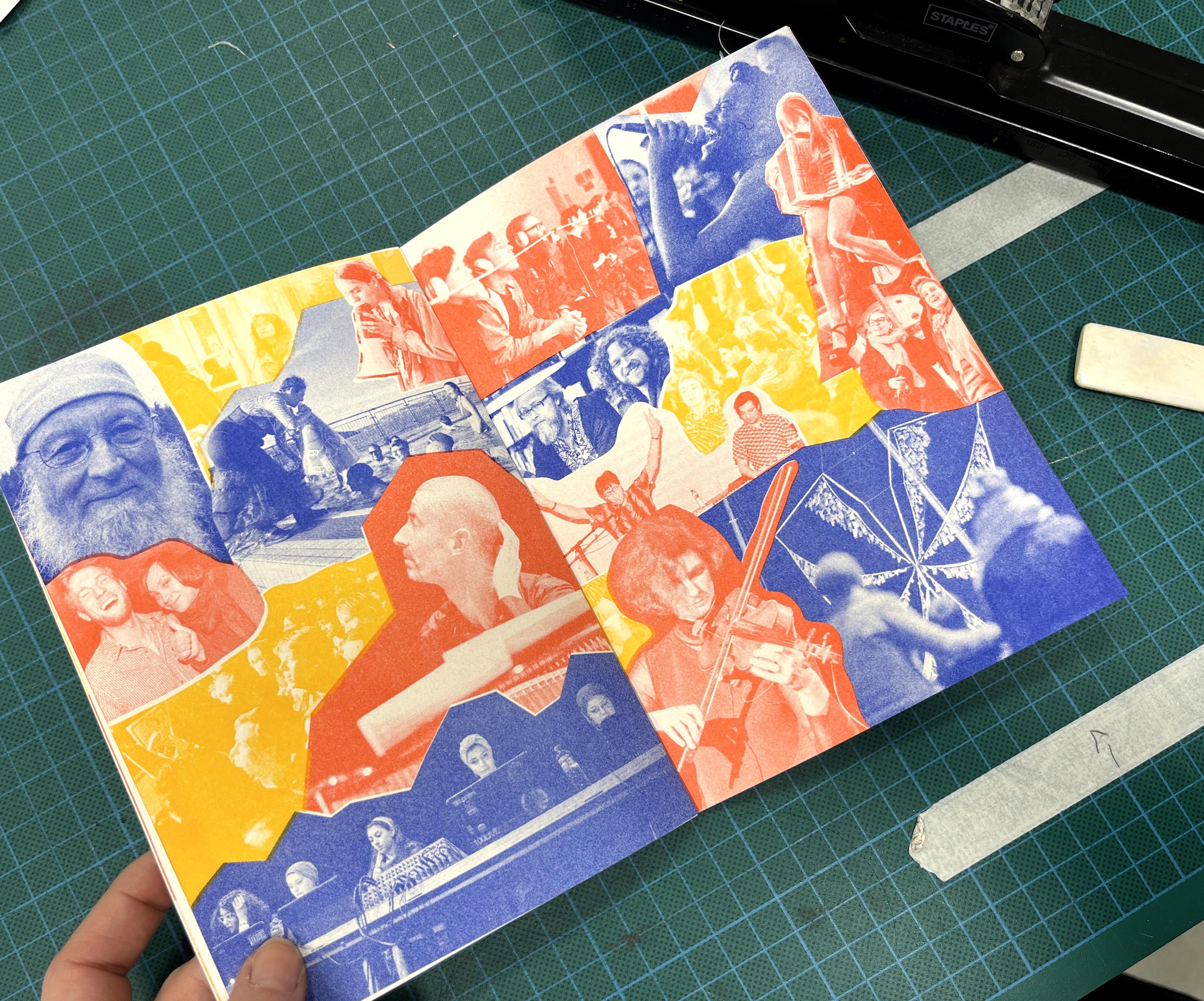
The inks used for these previews are (from top left to bottom right): 1. Fl. Pink + M. Blue, 2. Green,
3. Fl. Pink + Sunflower, 4. Green + Sunflower, 5. Fl. Pink, 6. Blue + Yellow + Pink.
Printing text
Keep these things in mind if your prints contain any text:
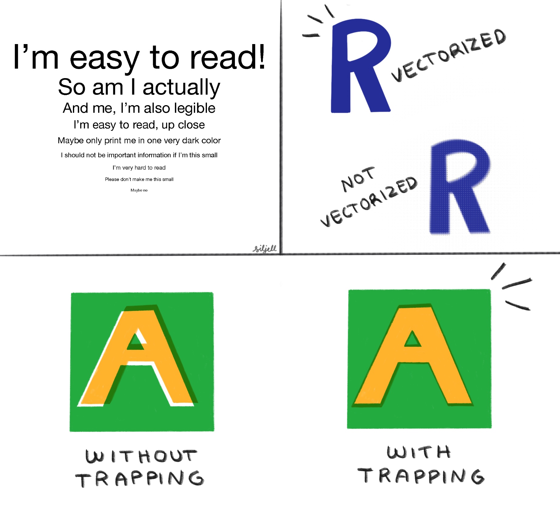
- To be sure the text is clear and has even edges, make sure it’s vectorized by using InDesign or Illustrator to add the text. If the text is made in Photoshop, and therefore not vectorized , the riso will treat the text as an image, which can result in uneven edges, blurring or pixelation.
- The smaller the text, the less legibility. To make sure your text will be legible and clearly printed, we recommend using text size 6 pt or more (this might also depend on the font). Larger if the text will be printed in a light color. Smaller text should always be in only one color, as the riso’s slight imprecision will prevent a 100% overlap of colors.
- If you are using knock-out text, meaning the text is a “hole” in the layer, we recommend using at least 8 pt, preferably larger. The riso reads knock-out text as an image, which can result in uneven edges. We recommend not using knock-out text through more than one layer. The more layers you are using the larger the risk of the white space being swallowed by the surrounding ink.
- If you are using knock-out text AND the text is in another color on another layer, the text needs to be bigger than the “hole”, to avoid white gaps between the layers during shifting.
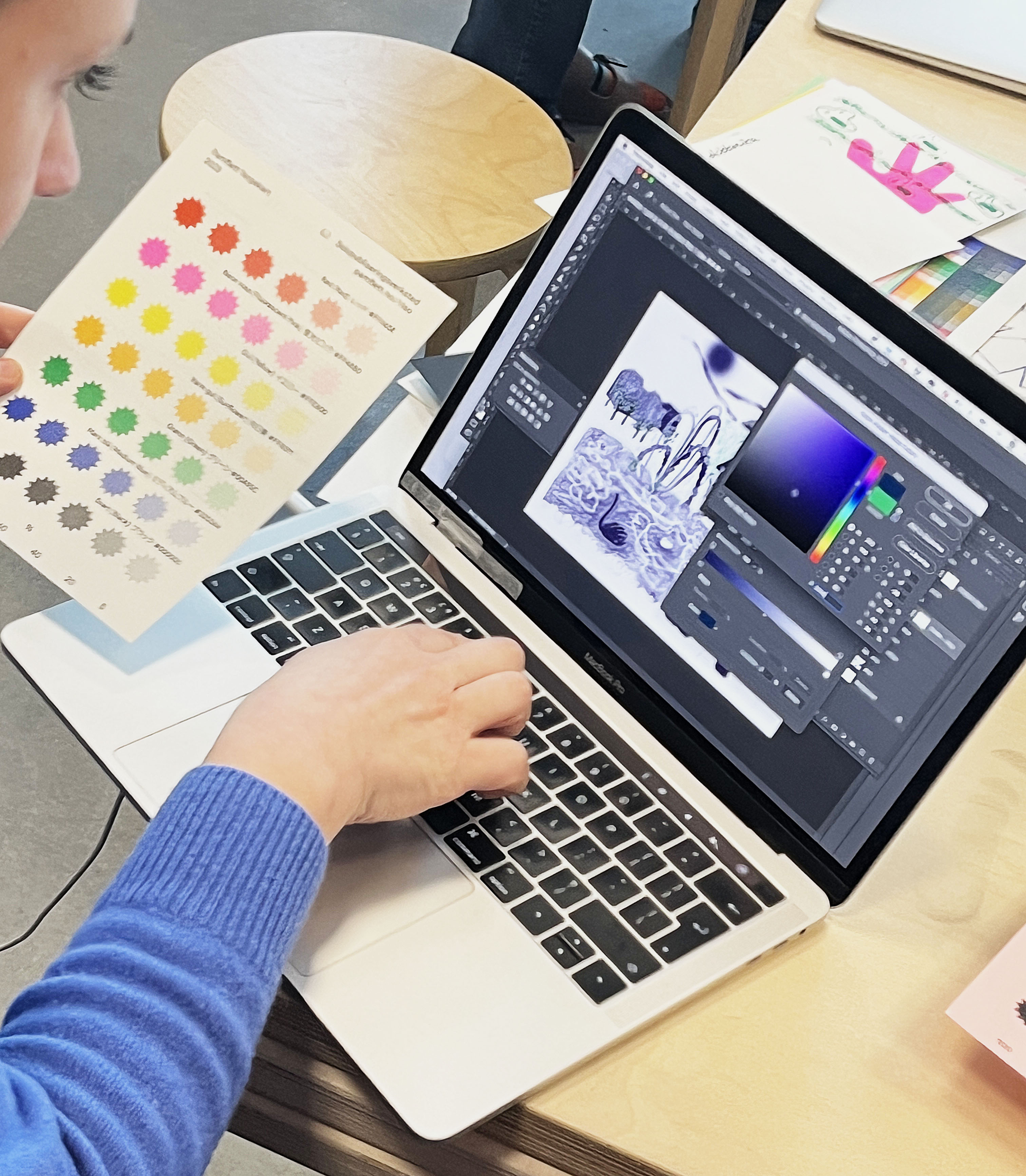
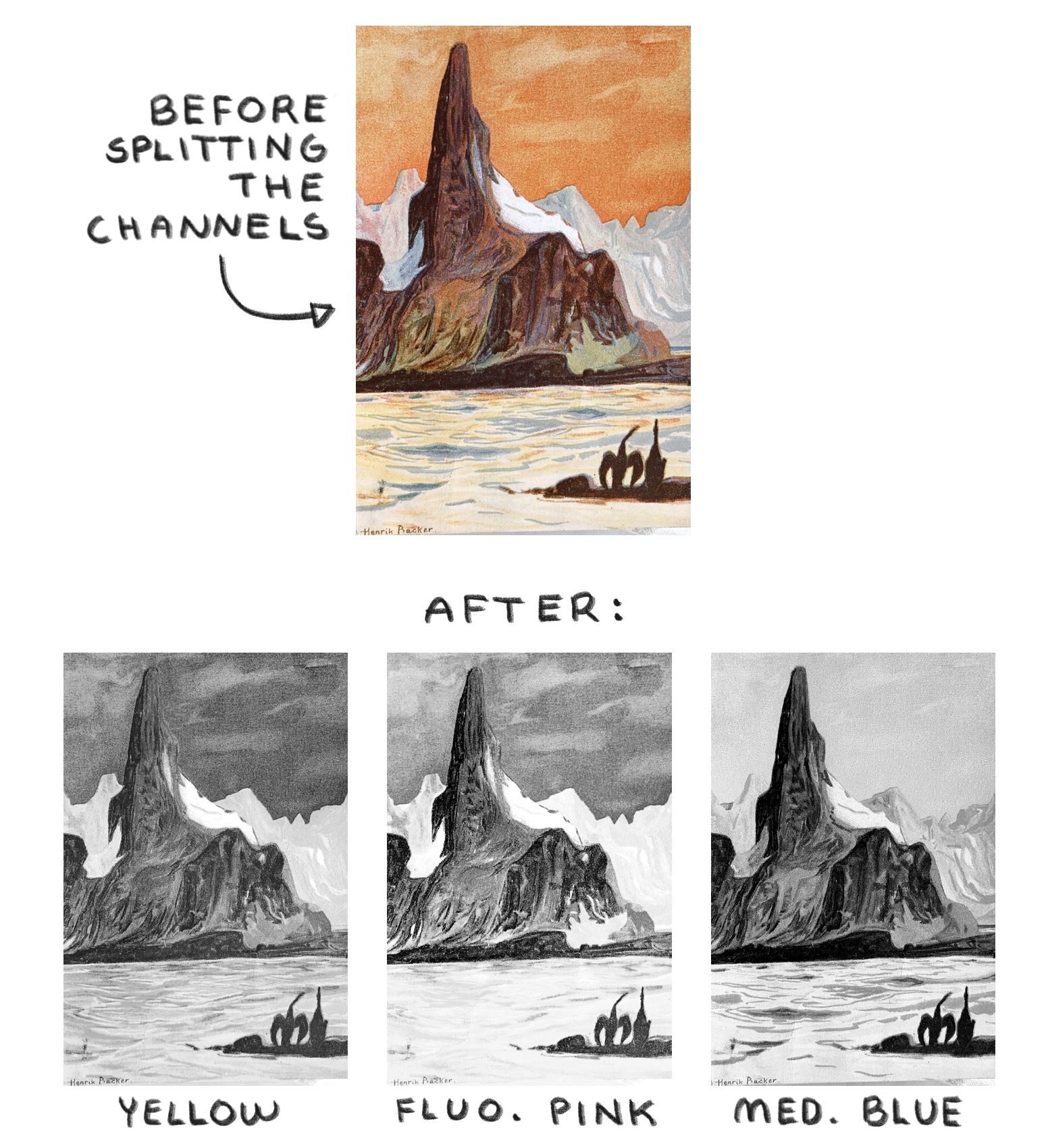
Color separation using Spectrolite
A simple way to color separate photographs and complex illustrations is to use Spectrolite (only for Mac for now). It’s free to download. You can also use it to preview approximately how the image will look using different riso inks.
Simple step by step tutorial to color separating in Spectrolite:
1. Go to Canvas, and drop an image into the box underneath “Original”, either by dragging an image from your computer folder into the box, or by clicking the box and selecting your image from your folders.
2. Go to the Inks tab, and select all of Pamflett's available riso inks (you can find our inks further up on this page).
3. Go to Palette, and create the combinations of inks you want to try on your image.
4. Select one of your color palettes in Palette.
5. Go back to Canvas, and click Riso-ify in the top right corner.
6. Still on Canvas, make sure PDF by ink is checked under Exports on the right hand side of the screen.
7. Click Export in the top right corner. You should now have separate greyscale PDF files for each of the colors used, as well as a preview file in color.
This is a simplified tutorial, and there are other possibilities available with the software. To learn more about Spectrolite, please visit their how to-page.
For files containing a lot of text or objects that don't need a complex color separation process, it's better to work directly in InDesign (or similar). Feel free to ask us for help or advice!
Color separation using Photoshop
Some general things go for all programs:
- Work in layers! Use one layer for each color you will print in.
- It is not recommended to simply convert colors from a finished illustration or photograph to greyscale and leave it at that, because colors like yellow, now matter how intensely saturated in the original, will never be automatically converted to a grey dark enough to print the same brightness and saturation. Therefore, make sure that you keep this in mind when converting, and edit the greyscale file to fit how much color you would like in your print. To be able to print in 100% yellow, the object in the file needs to be 100% black.
- Transparency and overlapping effects, like Multiply and Overlay, can create glitches in your image if the layers are not merged or flattened before export. NB! Make sure to make a copy of your file BEFORE merging or flattening, as this cannot be reversed. To flatten in Photoshop: Layer -> Flatten Image. To flatten in Illustrator: Object -> Flatten Transparency.
- As mentioned under the Text section, use InDesign or Illustrator to add text, not Photoshop.
Photoshop:
When creating a file in PS, make sure to work in layers, using one layer per ink color. When exporting, go to File -> Export -> Layers to files. Choose the highest quality, and “PDF with JPG encoding”. You should have one file per color layer. Rename these files with your project name and ink color for each layer, for example “SunsetYellow and SunsetRed” or “Festival_Blue” etc.
Simulating CMYK-printing in Photoshop:
Open your color image in Photoshop. Convert to CMYK by going to Image -> Mode -> CMYK. Make any adjustments you need for your image. Open the Channels panel. Go to the menu in the corner of the window, and click Split Channels. This will create four greyscale files, one for each of the CMYK colors.
If you are new to the process, and don’t have time to learn yet, we can do the color separation for you! Please contact us so we can make time- and cost estimates and find a good solution for your project.
Quirks
Riso ink does not technically dry, instead it absorbs into the paper. This is more environmentally friendly than drying the ink with heat or using chemicals to make it dry faster. However, it does mean that we have to be mindful of some riso quirks while planning and printing.
Roller marks:
When printing with more than two colors, if the ink is still somewhat wet on the page, the wheel transporting the paper into the machine gets stained with ink. When it pulls the paper in, it will roll across the middle of the paper, leaving thin stripes of color. How visible these are depends on the amount of ink, how dry it is, and on the colors. This means we need to account for drying time when planning your project, depending on how much ink is used, and whether it’s a one-sided or two-sided print. We also have to take into account the order the layers will be printed so that the inkiest layer goes last when possible.
Imprecision:
The riso is not a 100 % precise machine, and the paper always shifts ever so slightly while printing. Because of this, we cannot guarantee perfectly aligned prints. To make the results as precise as possible, we usually use crop marks (made by us), and follow the printing process closely to adjust for any shifts. Additionally, there are a couple things that make this easier. If you are printing shapes on different layers that should be perfectly aligned next to eachother, we recommend overlapping them slightly using trapping, so that when the layers shift there won’t be a white gap between them. If you are putting a shape in one color inside of another shape in another color, make the innermost shape a little bigger than the hole in the surrounding layer, so it can shift without said white gap. The same goes for text, which you can read more about near the top of this page.
Large areas with 100% ink:
Printing a color evenly across large areas is not realistic on the riso. If you want to print a large area in one color, we recommend reducing the ink coverage to maximum 80%. The risk of using 100% color on a large part of the paper, is that the paper will stick to the ink drum causing paper jams, which will in turn makes a mess inside of the machine, which can take a lot of time to clean. The print itself will also be difficult to handle after printing, since it will be very wet. If the paper is thin this will be especially difficult.
Photographs:
It’s possible to simulate CMYK-printing quite well for photographs, like mentioned under Color Separation in Adobe Photoshop, but it cannot replicate your photograph’s colours exactly. And because the layers will shift slightly as mentioned above, it will also not be 100% perfectly aligned. We recommend doing this on bigger images with less detail.
Disclaimers
We want to help you get the prints you envisioned, and we always do our best to make sure it turns out as great as possible. For us to be able to do this, we need as much information as possible about what result you are aiming towards, and preferably a preview, sketch or dummy that can help us see how the result should look. It doesn’t have to be 100% accurate (or pretty!), but it should help us understand what your idea is.
We do everything we can to ensure that the files are ready for printing before we begin, and if we notice an obvious problem we will get in touch. However, you are responsible for making sure the files you send to us are ready and do not contain mistakes. We cannot always tell if something is intended or a mistake.
Make sure to take a few extra looks, check that your files are named correctly according to ink and page numbers etc., and that the images/shapes/text are not blurry or pixelated, as well as checking that everything is placed where it should, and there are no typos. Check the File Preparation section, as well as the Text section, before sending your files.
If you have any concerns or questions, we’re here for you! Send us an email at hei@pamflett.no.